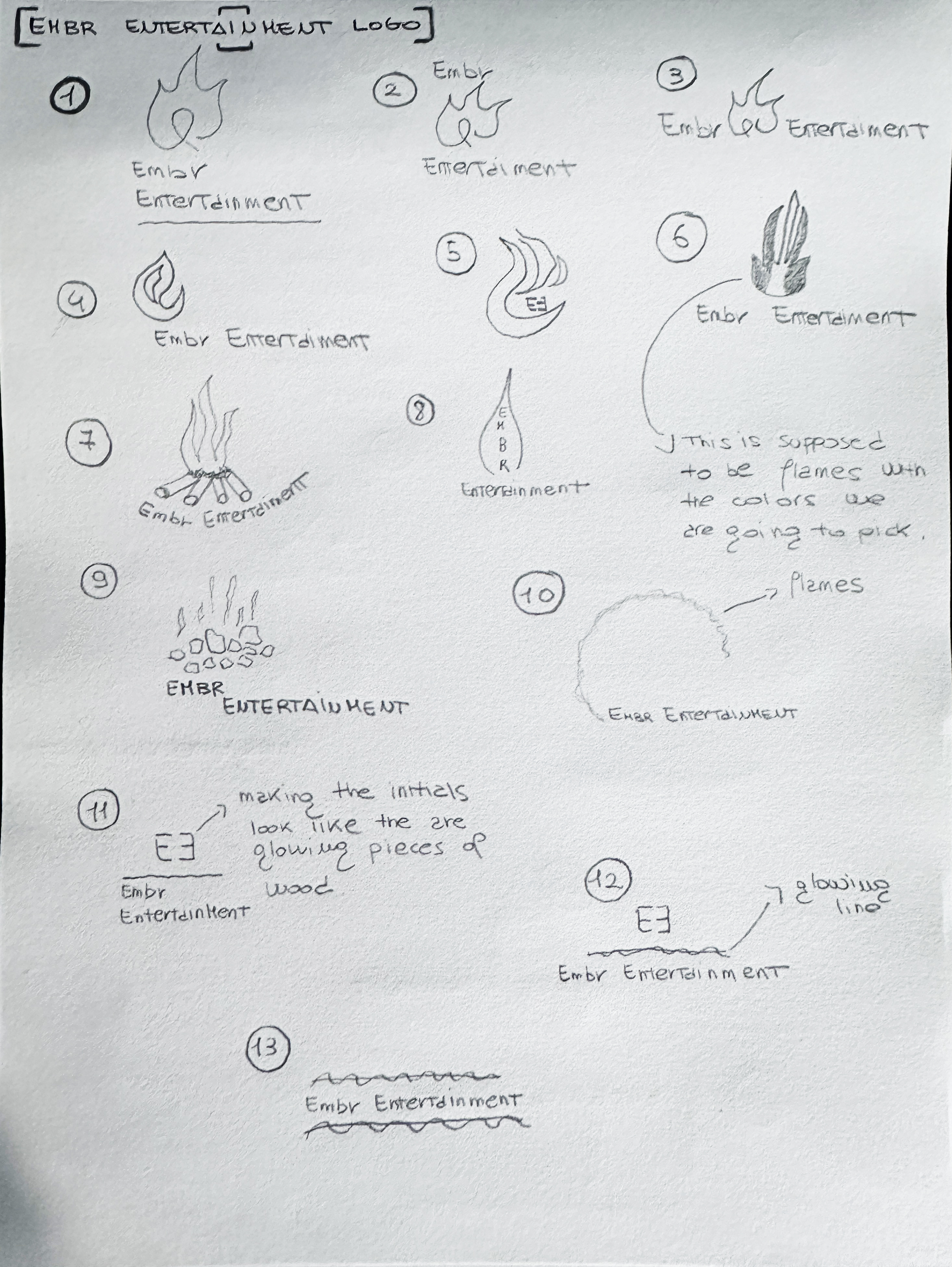
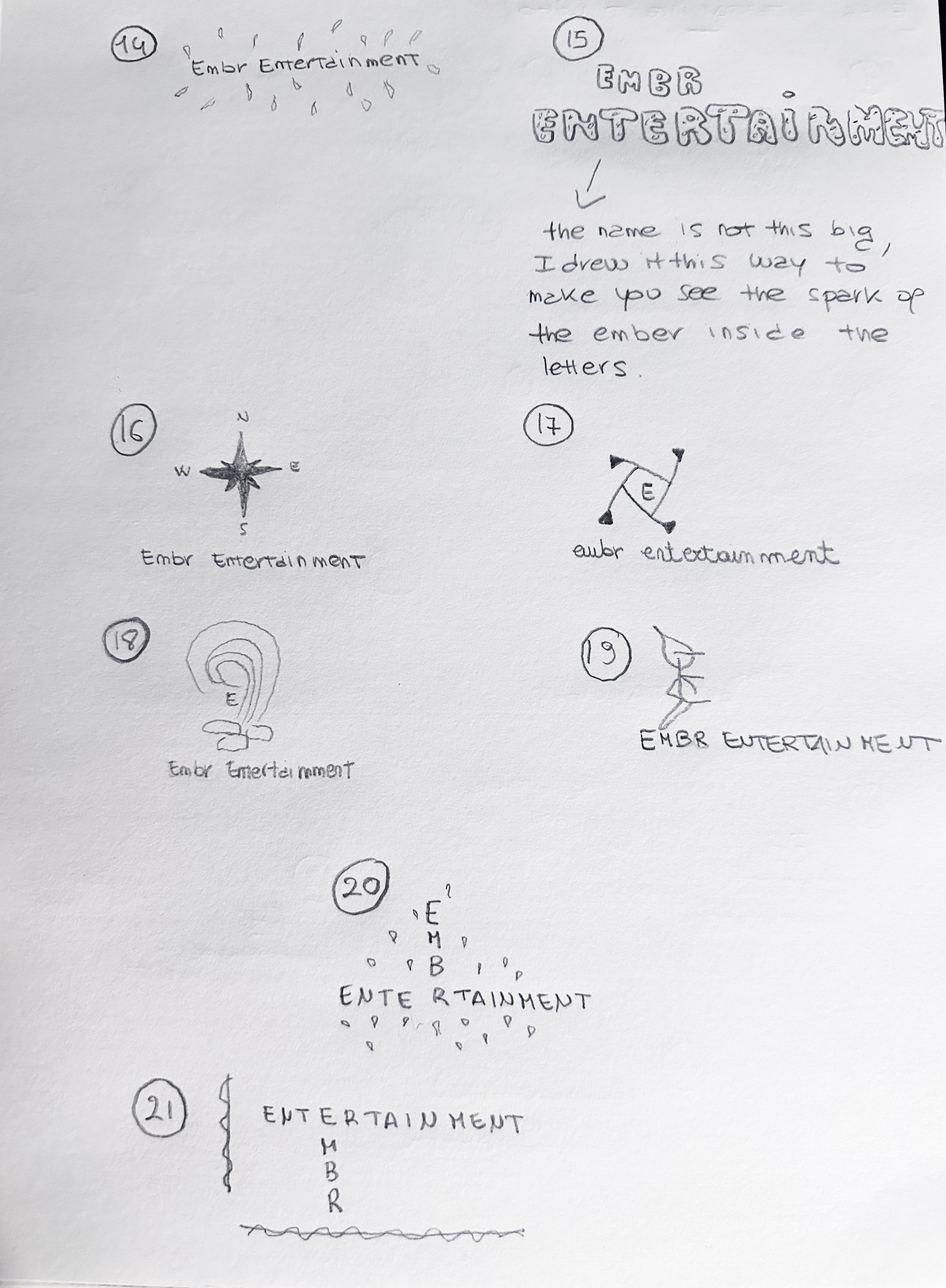
I designed this logo for the company I currently work for as Graphic Designer. I undertook the task to create a new logo to give the company a fresher look and to make it easier for Embr to stand out. The name Embr, where the second E was intetionally dropped, came from the mind of my employer, Chris Wicke. He is the owner and founder of Embr Entertainment. He took the inspiration from ember, a small, glowing fragment of burning wood, coal, or other solid fuel that remains during or after a fire; the fact that even without a flame, an ember is extremely hot and it makes it possible to restart a dying fire is used as a methaphor to embody the passion, the dedication, the ability to always evolve, reborn from the ashes and keep thriving as core qualities of this company.
In the sketches you can see below, I was at first both ocusing on trying to merge the name of the company with a flame or anything fire related, and playing with the initials and other elements. I wanted to explore different routes before making a final solid decision.
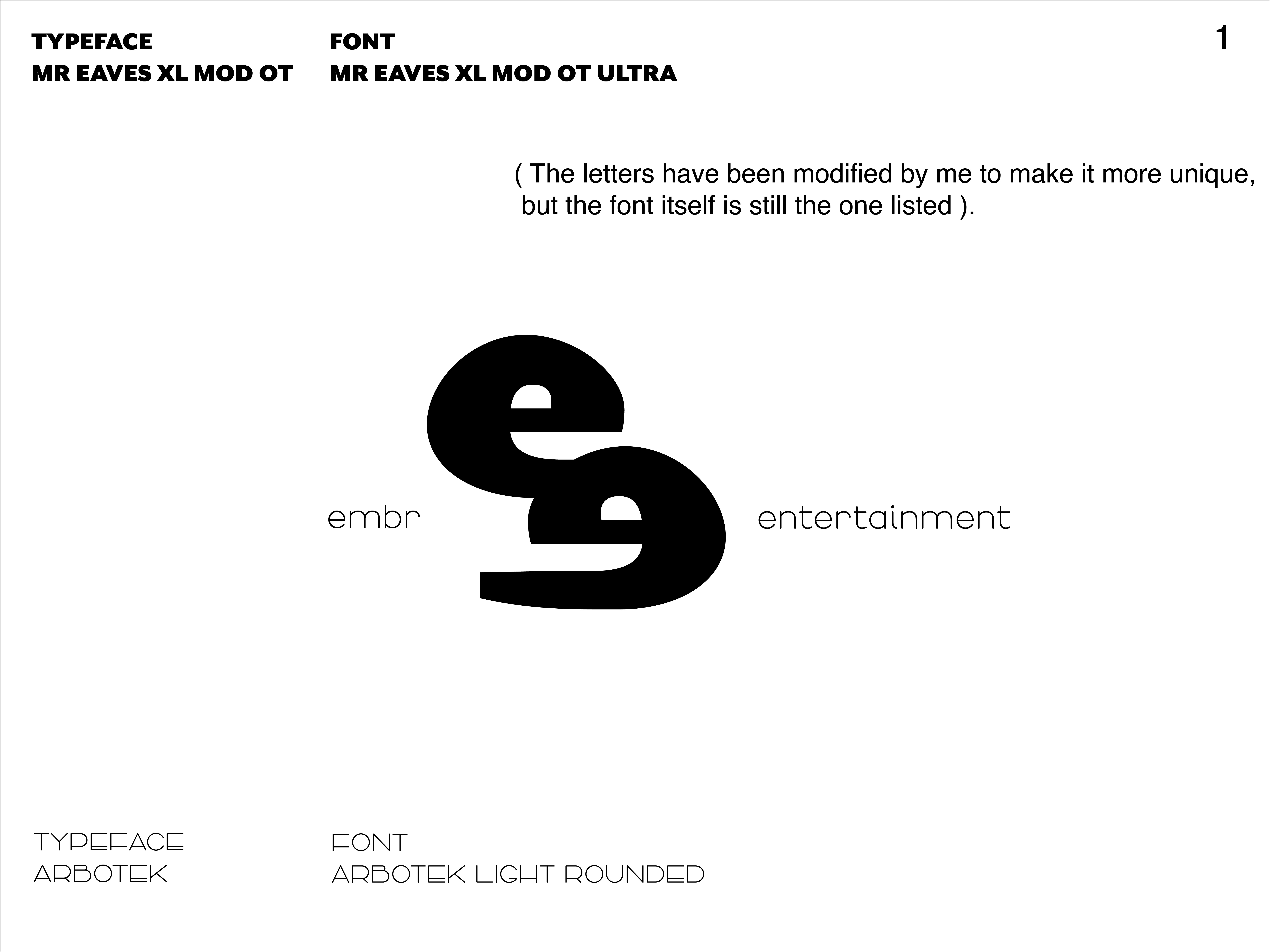
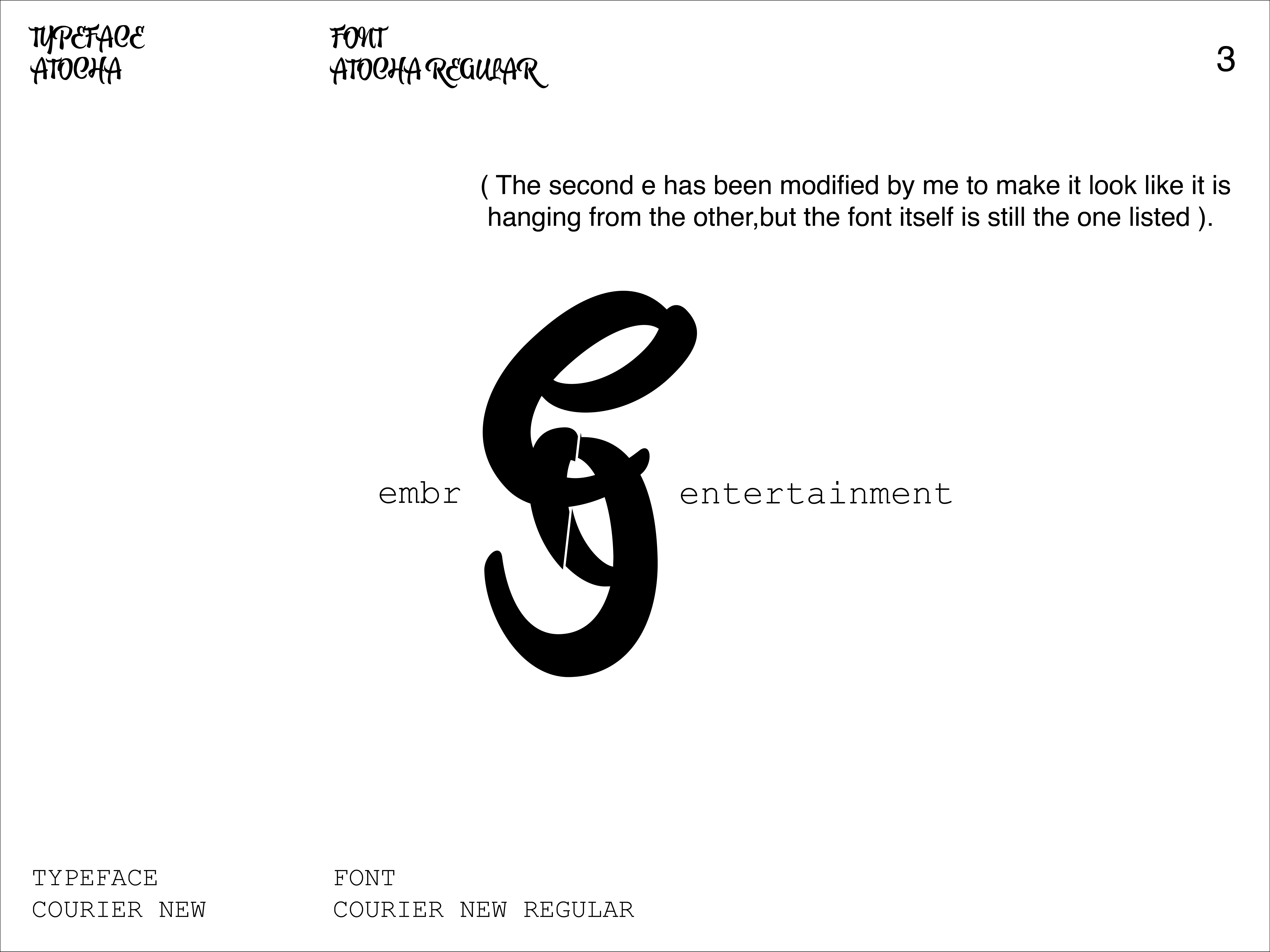
For the digital iterations of the logo, I decided to try different typefaces and fonts with the double E and the full name underneath. Right below, you can also see the reaserch I did to try to find the right color that matches Embr core values and qualities.
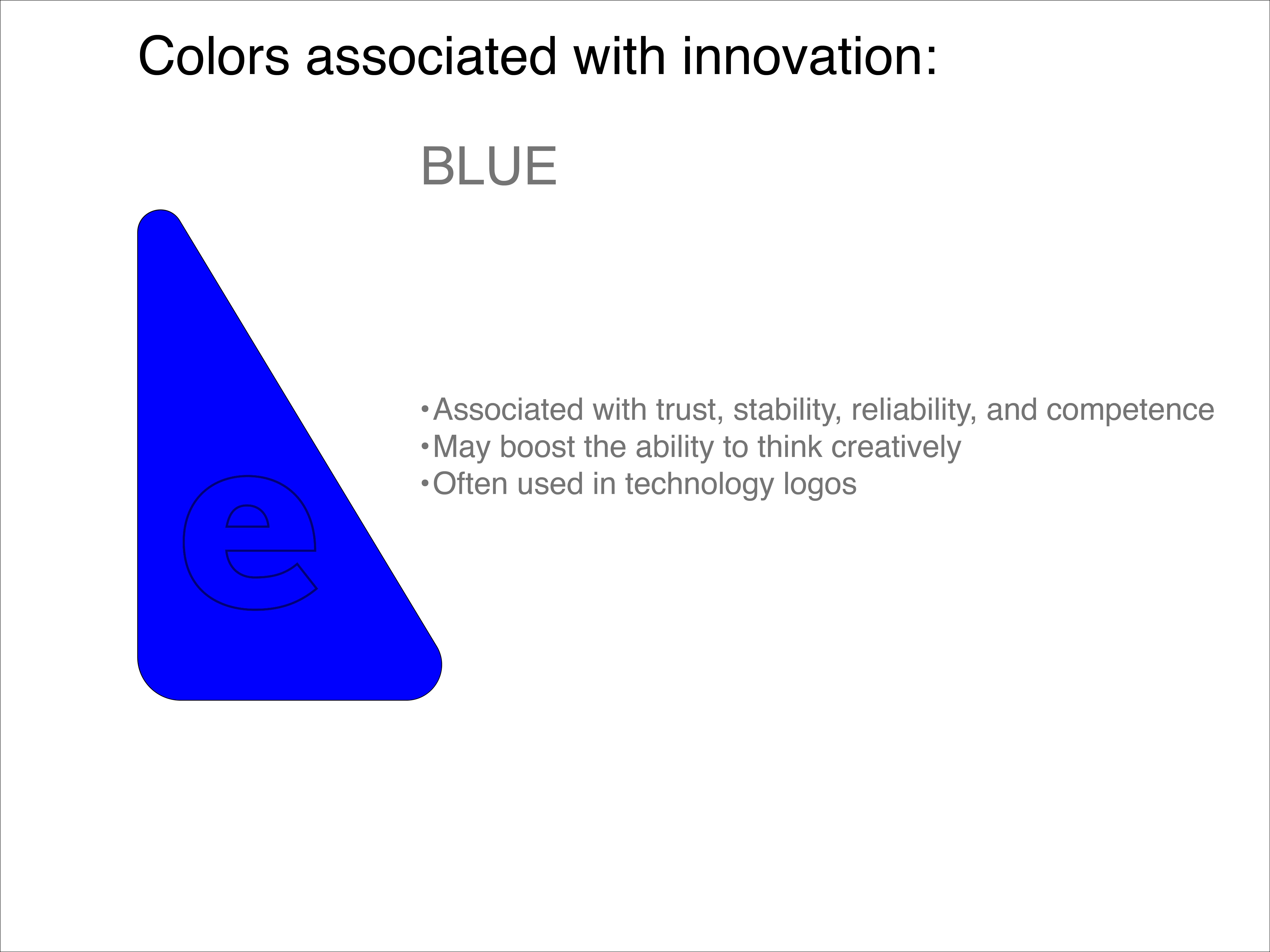
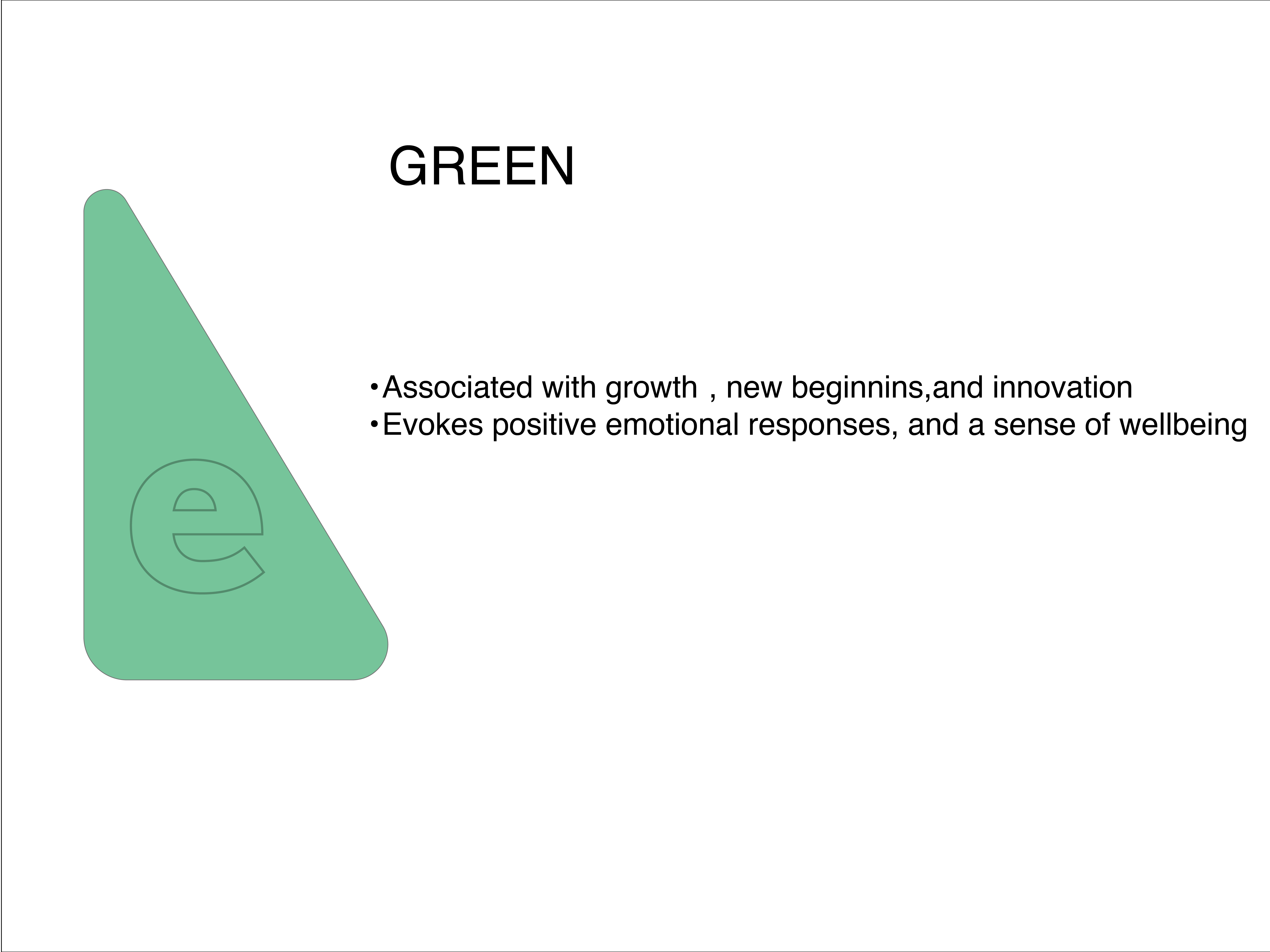
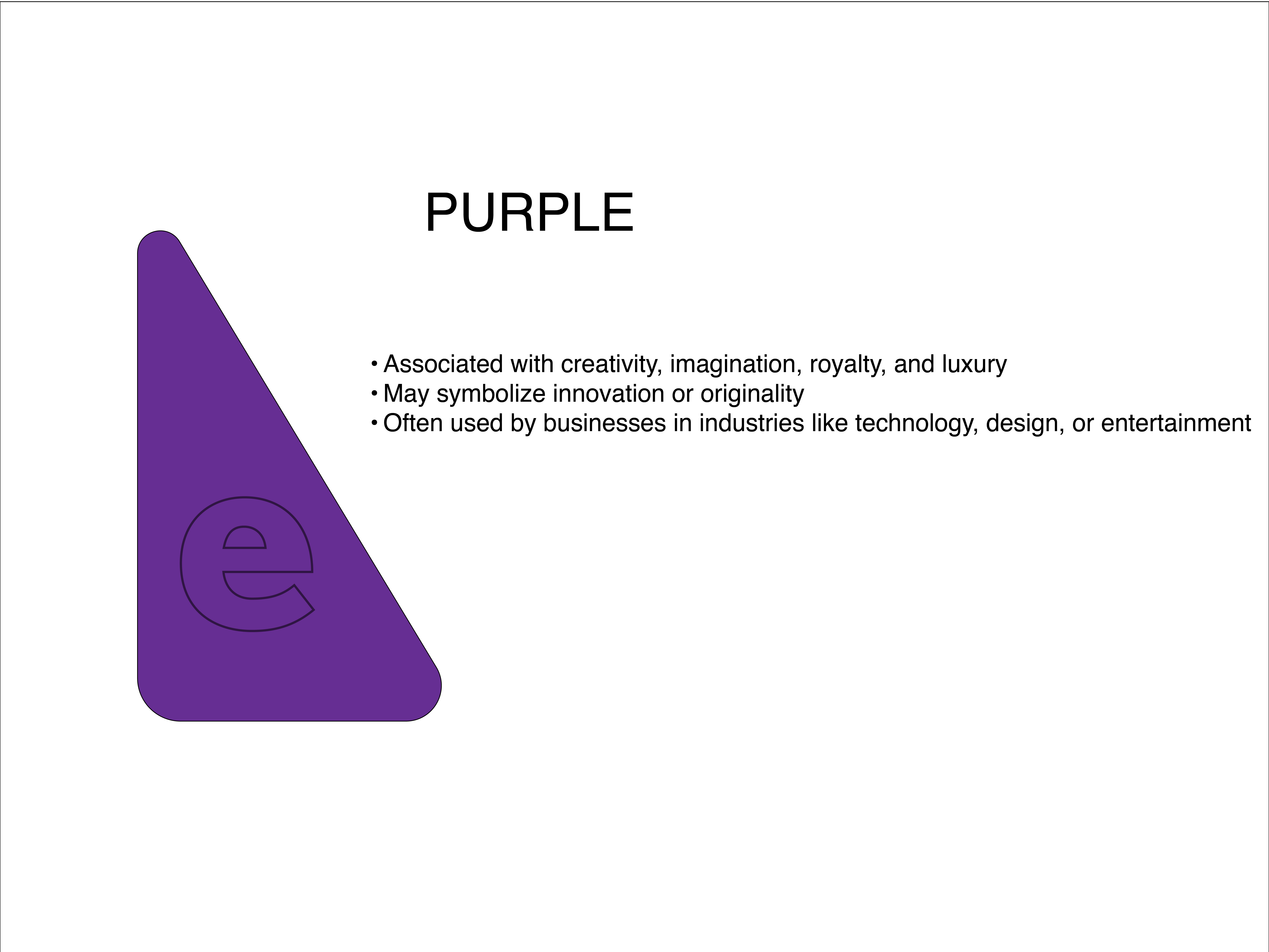
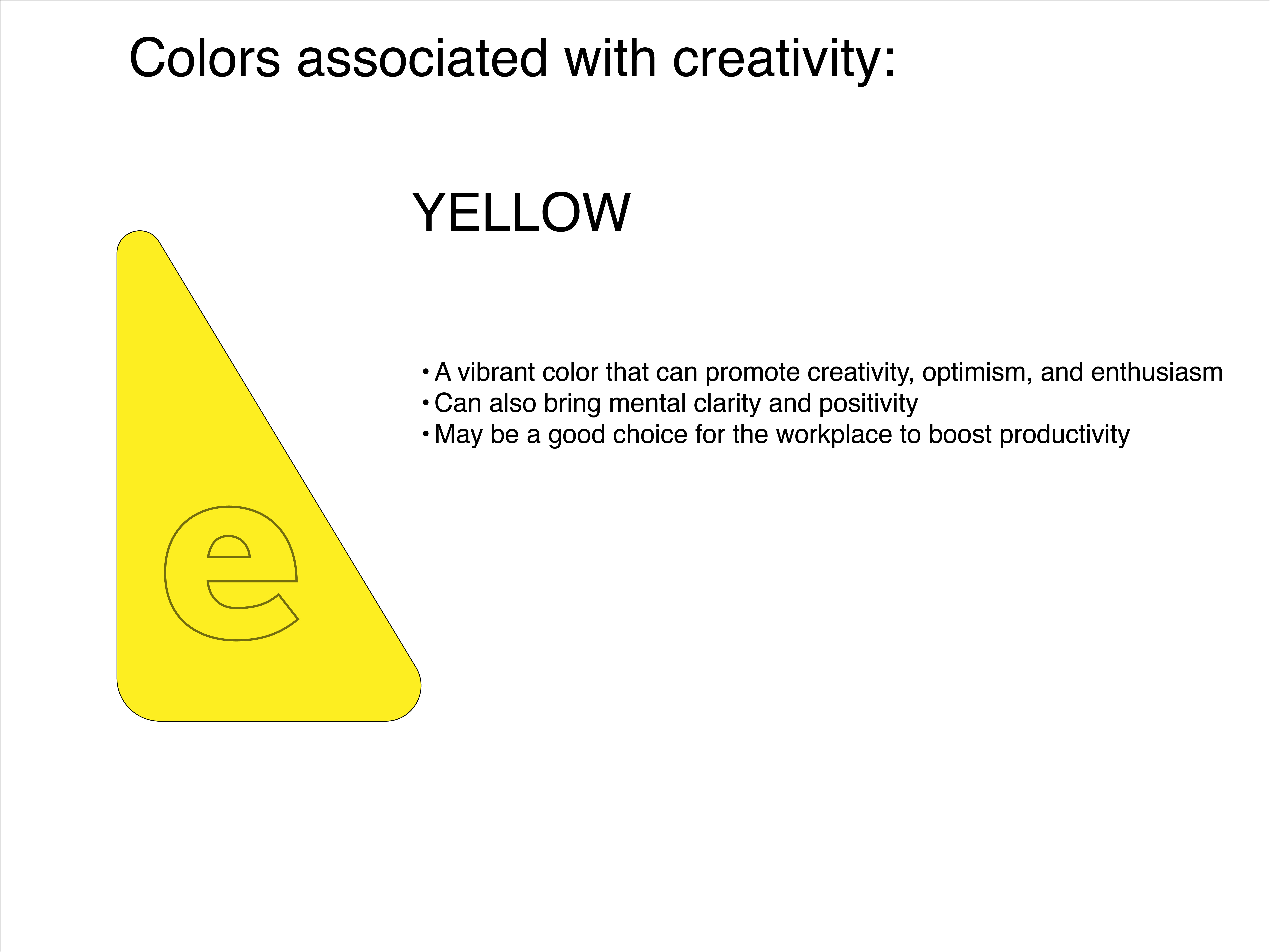
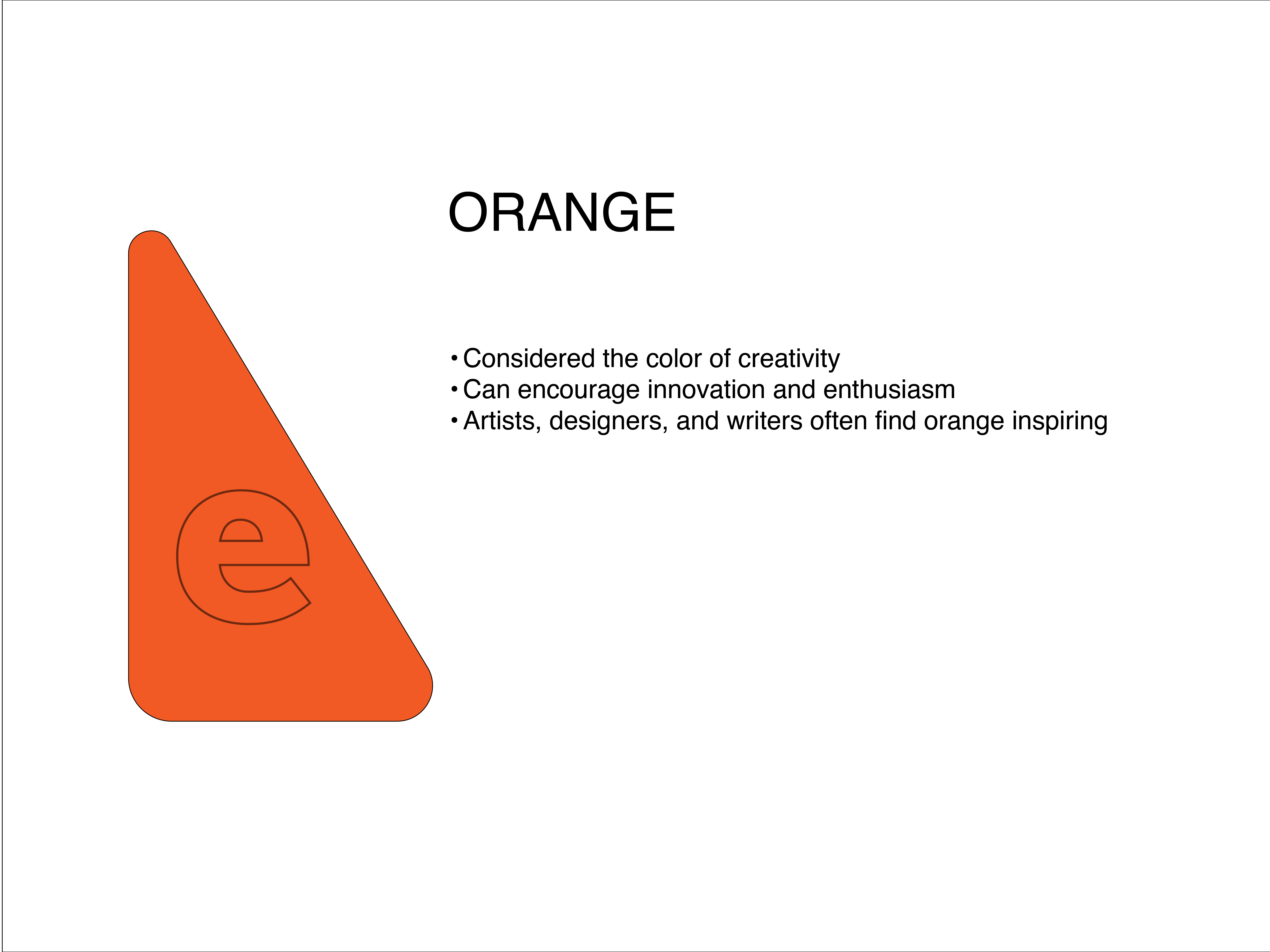
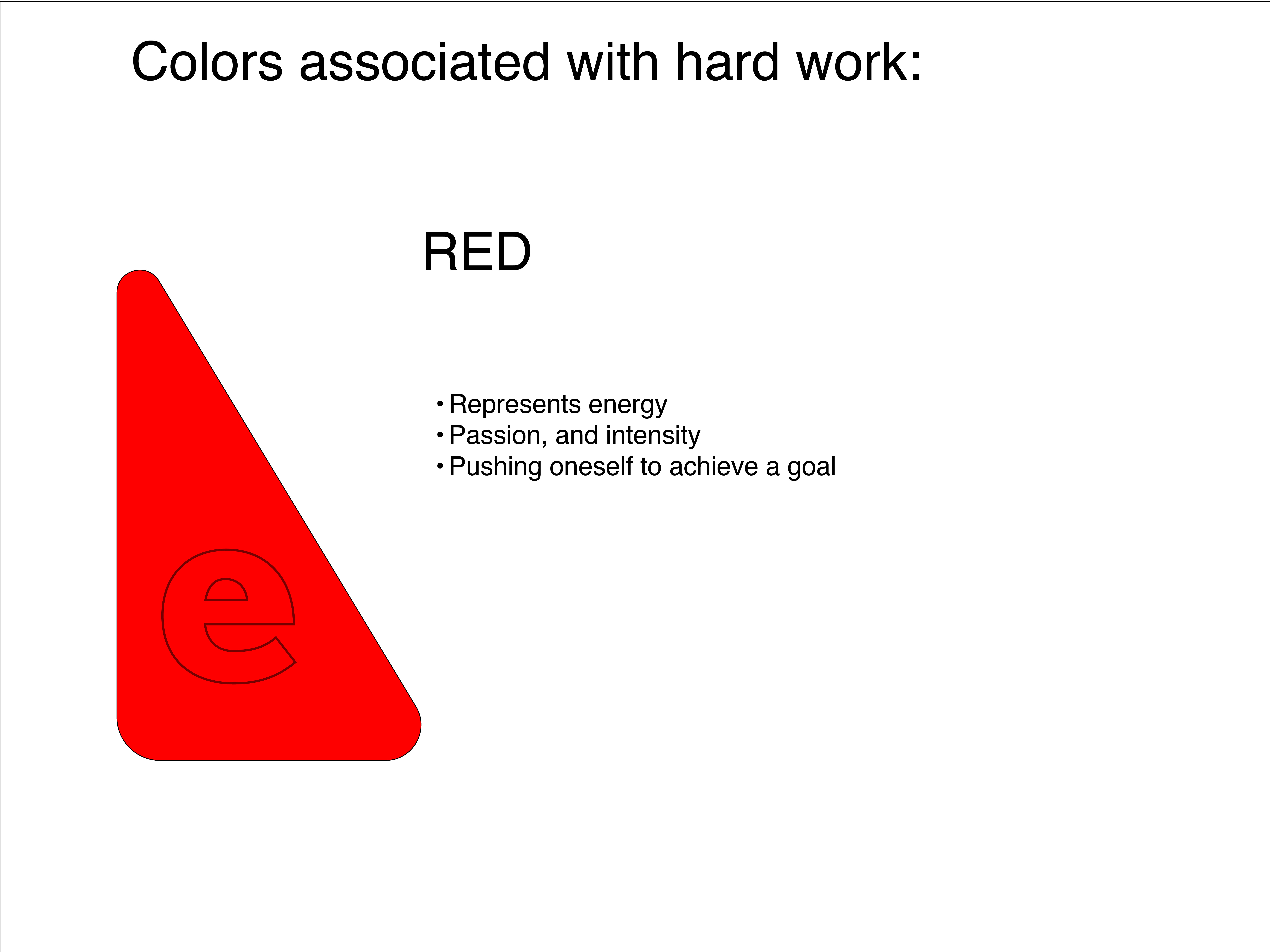
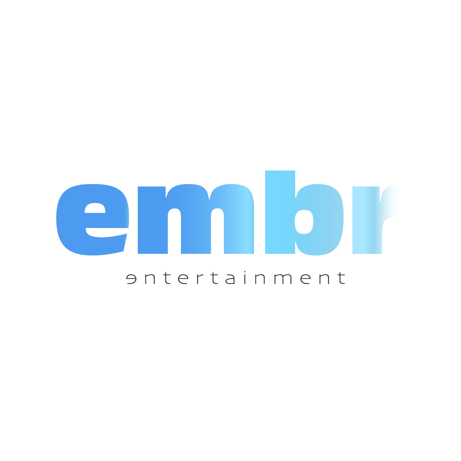
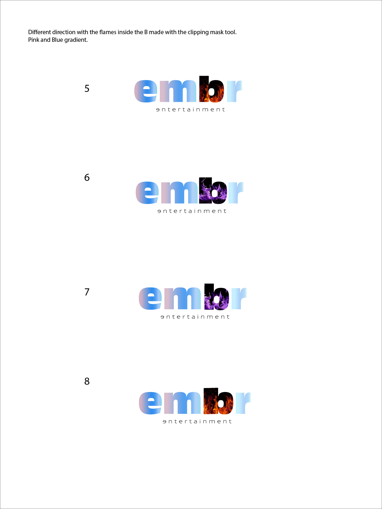
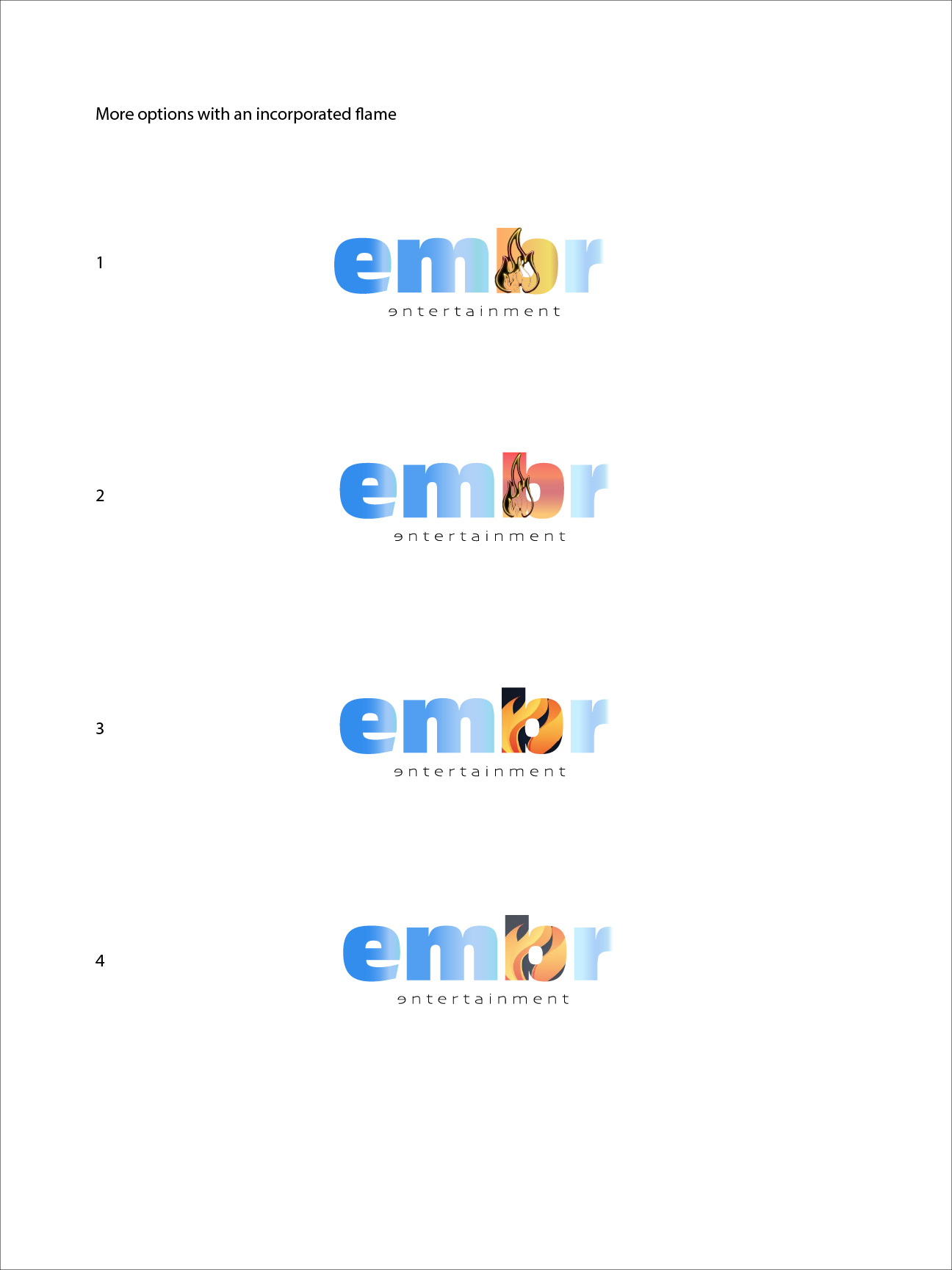
After carefull consideration, a different path was taken which entails the use of the word embr as the main focus with entertainment as a sort of tagline. I played with the colors I researched for and tried to see which ones would suit better Embr and everything that comes with it.

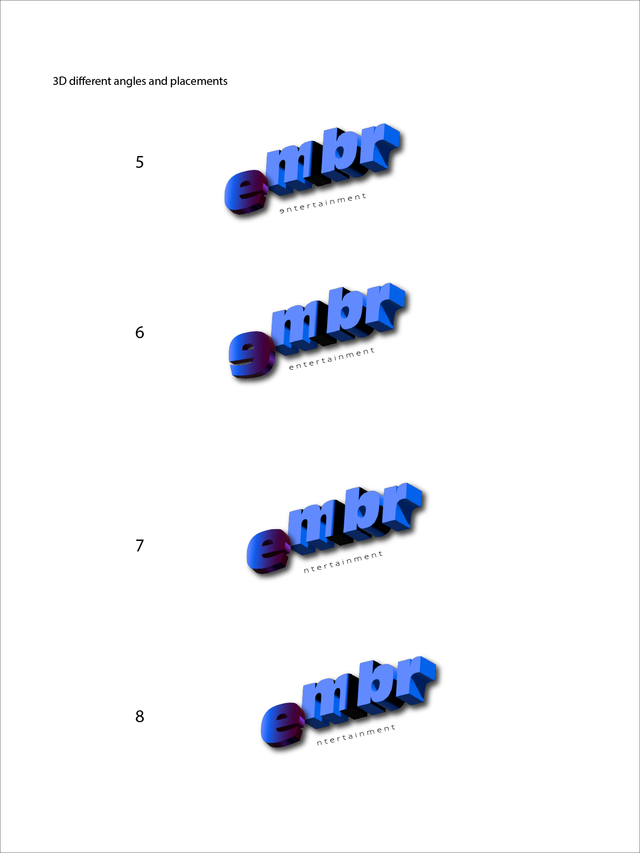
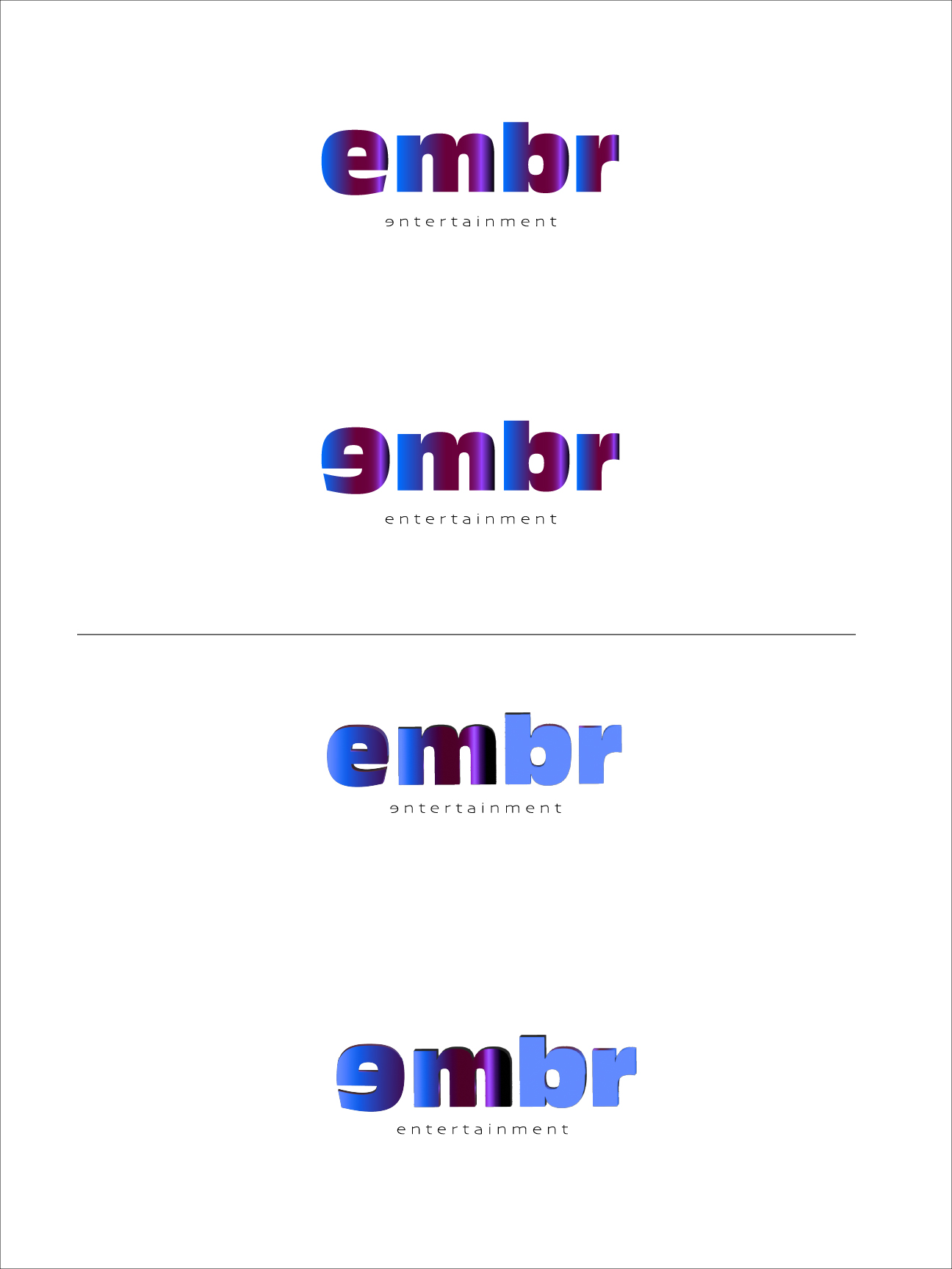
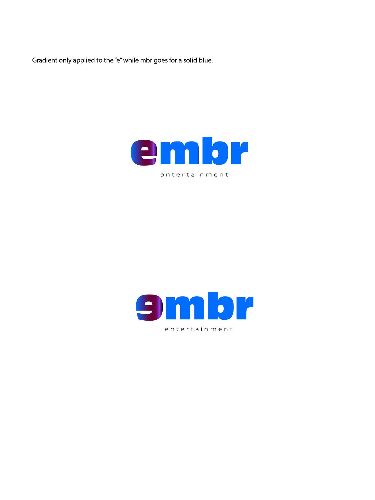
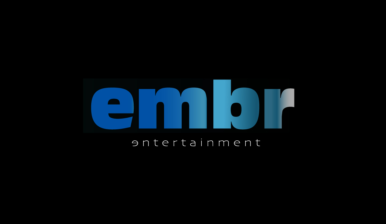
Eventually, I decided that the best way to represent what Embr Entertainment is, was to use the color blue with a gradient that mimic the burn of an ember. You can see the white background and the black background versions.